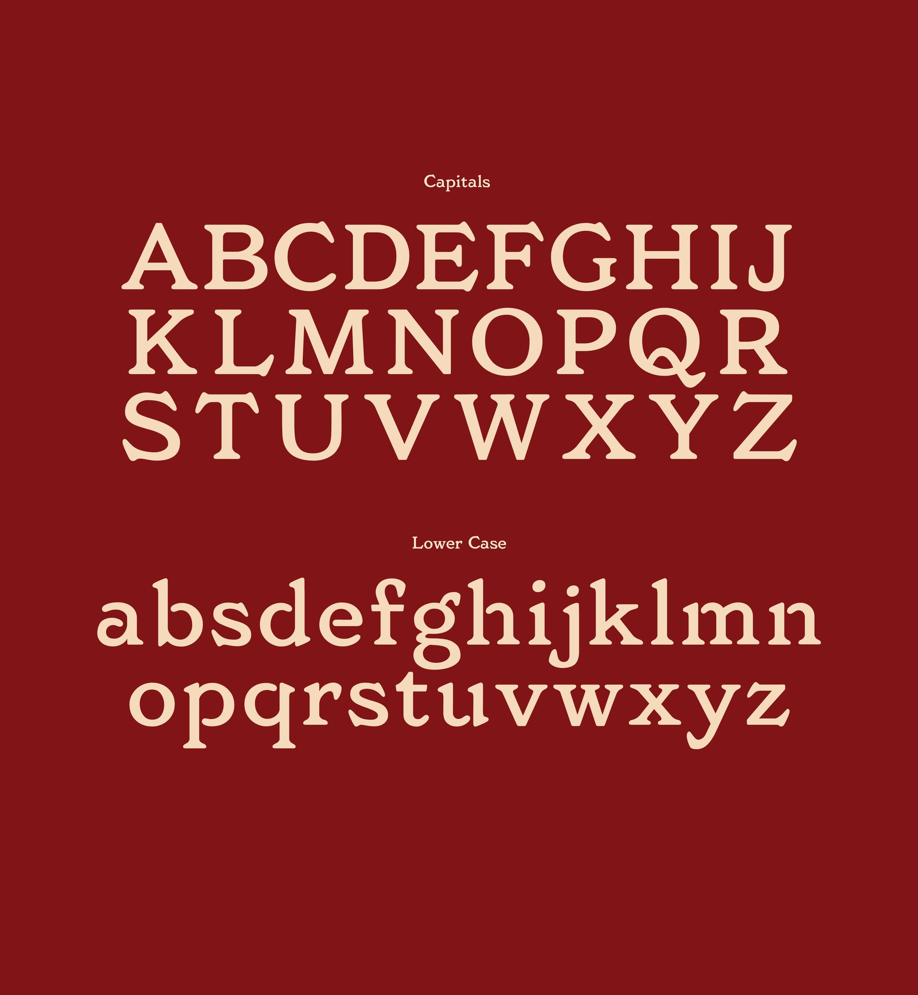
Butcher Serif
Guided by typography expert Karen Cheng, my group designed a serif typeface characterized by its boldness, unique serifs, and vintage-inpired aesthetic. Our group crafted an upper and lowercase alphabet with numbers and punctuation. Starting from one inspiration photo, we hand drew and then created each letter in Glyphs before bringing them all together to make our type design posters.
Software
Glyphs
Figma
Collaborators
Mina Lim
Elva Chen
Kavitha Krishnan
Alice Dibbo
Course
Marks and Symbols
Instructor
Karen Cheng
Duration
5 weeks


Beginning Stages
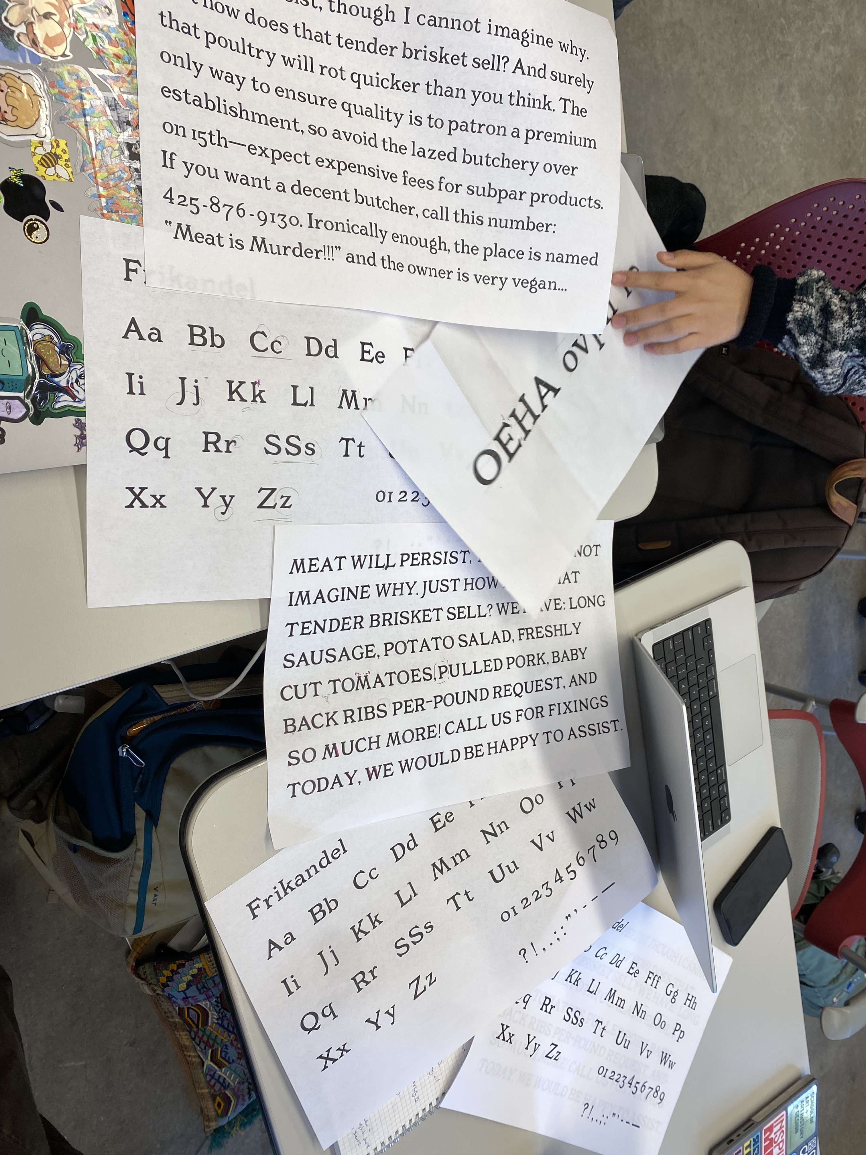
Our group was assigned this reference of a sign outside of a Dutch butcher 'Slagerij', characterized by its round and wide letterforms, distinct serifs, and stencil style lettering. We were also provided with a sheet of control letterforms to build the rest of our typeface around. With these starting points, we needed to also develop a deeper knowledge of letterforms in general, so our instructor Karen hosted a calligraphy workshop guided by expert type designer Marta Bernstein.


Iterations
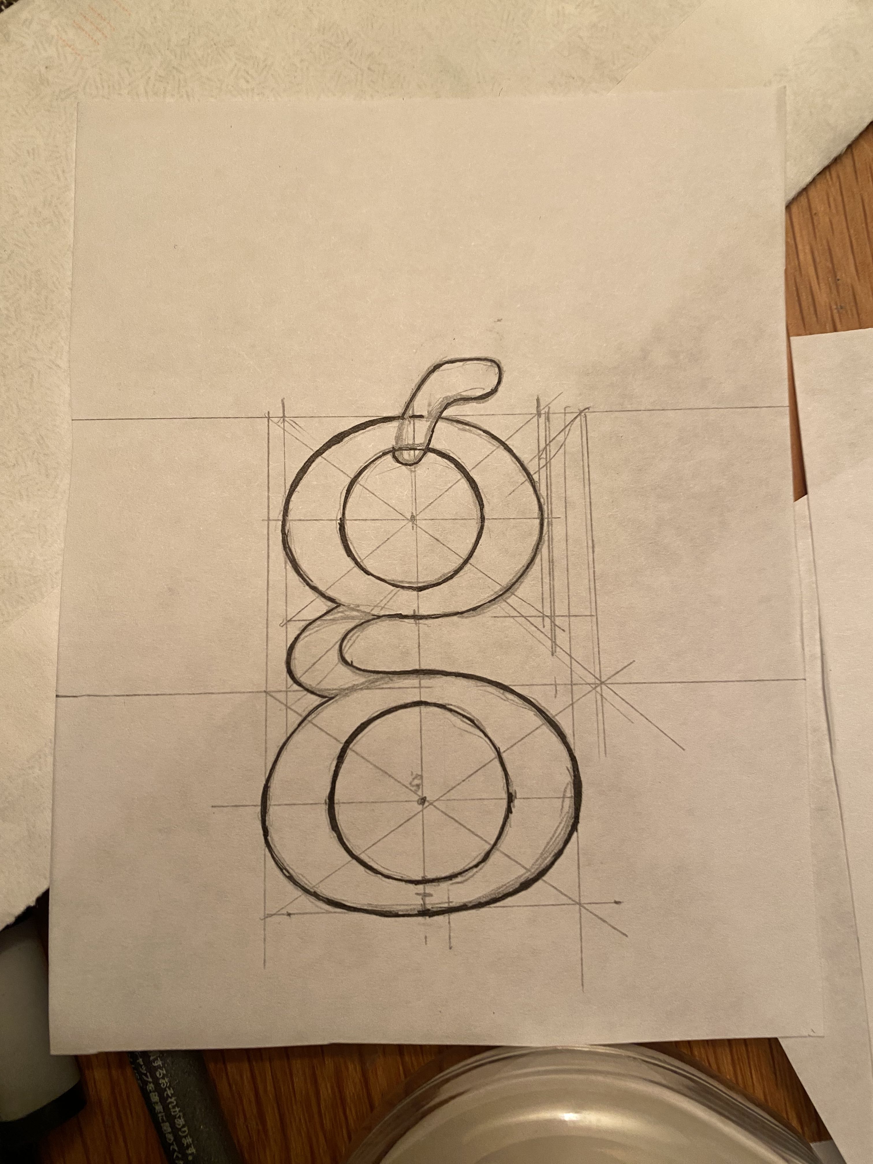
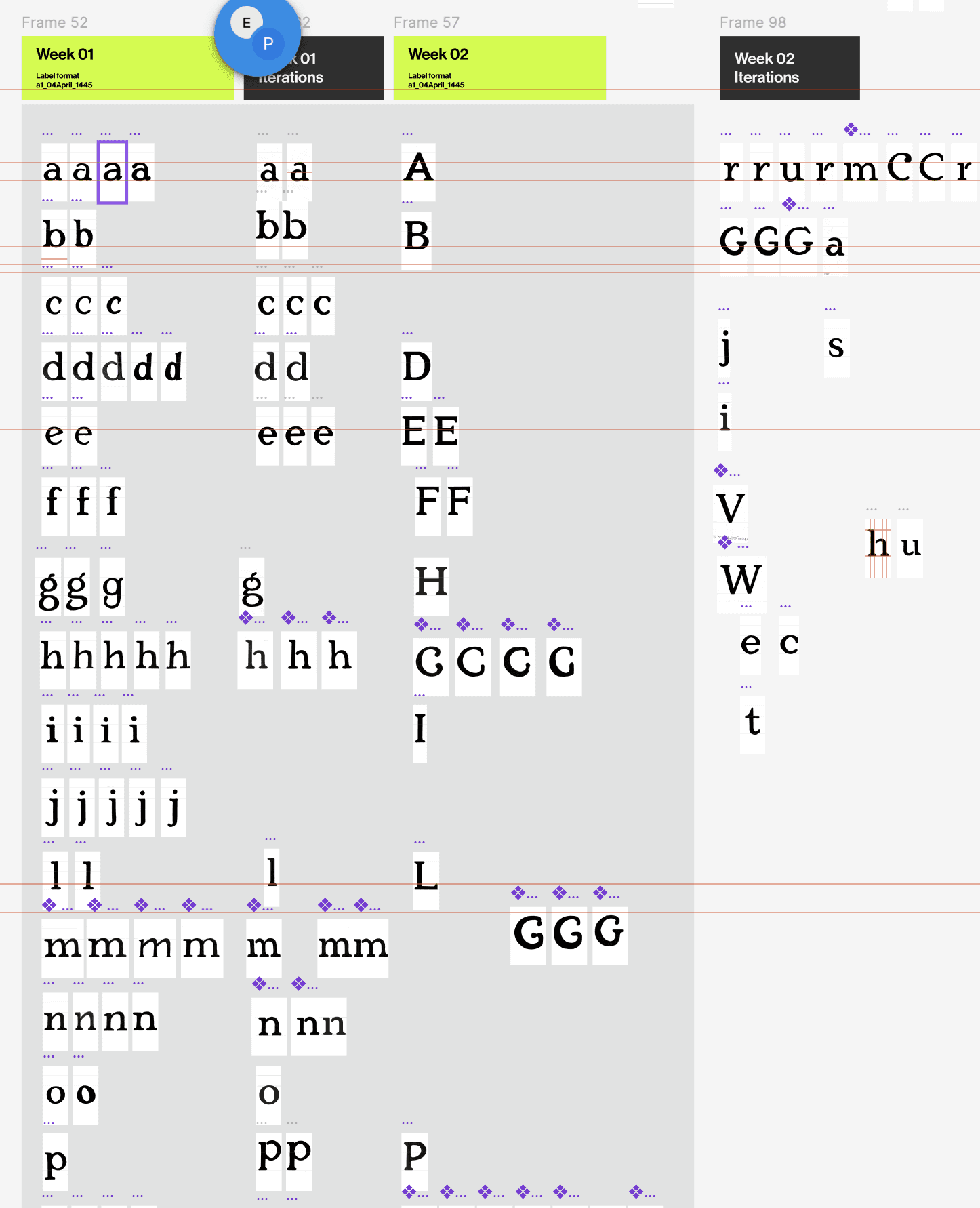
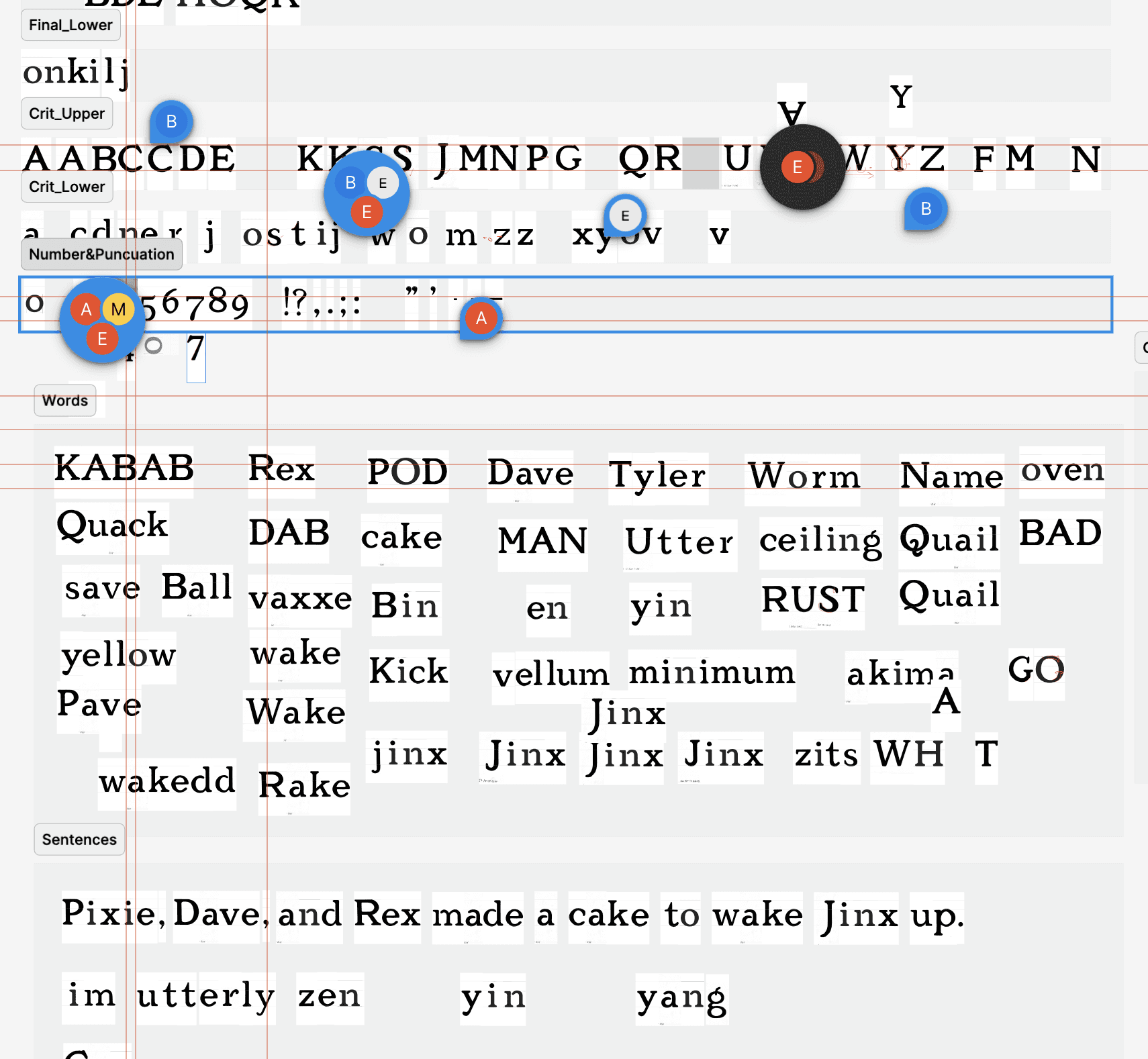
Once we had established our groups' letterform style based on Slagerij, we began the process of hand drawing multiple versions of each letterform to bring in for critique. Through multiple critiques, we worked to refine every curve and facet of each letter to perfection.


Development
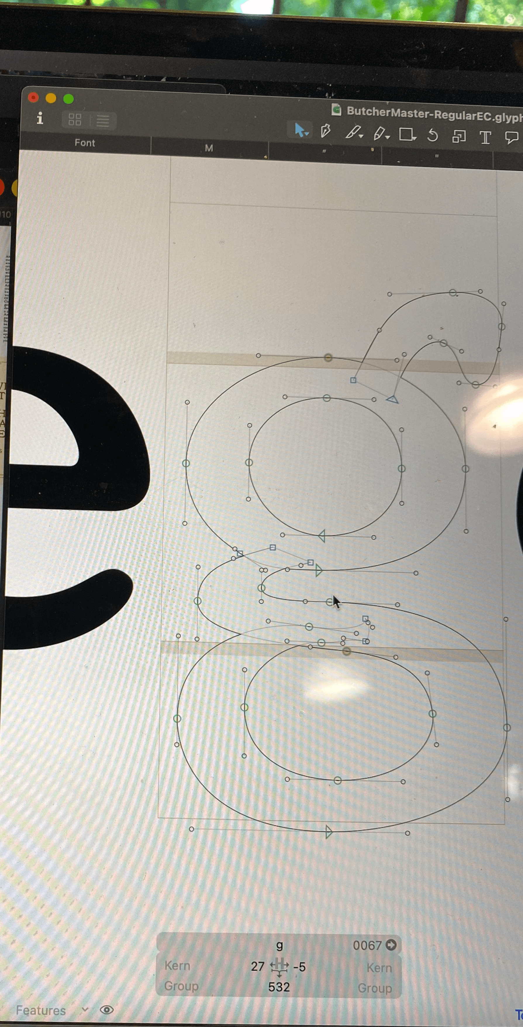
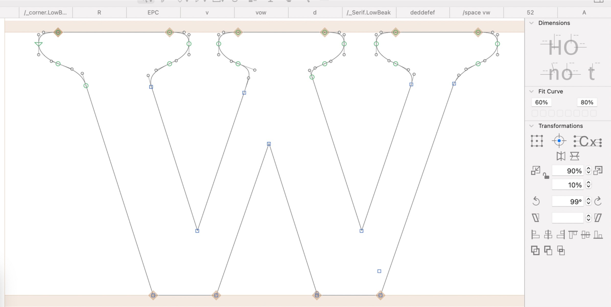
Next, we brought our letterforms from paper into the software Glyphs, where we crafted each individual letterform. Through this process we would be constantly comparing letters to one another and our original reference material to ensure we were building a cohesive typeface. When the letterforms were done, we spent countless hours adjusting and refining each letter and number, as well as defining the kerning and spacing between pairs and combinations of letters.
Final Stages
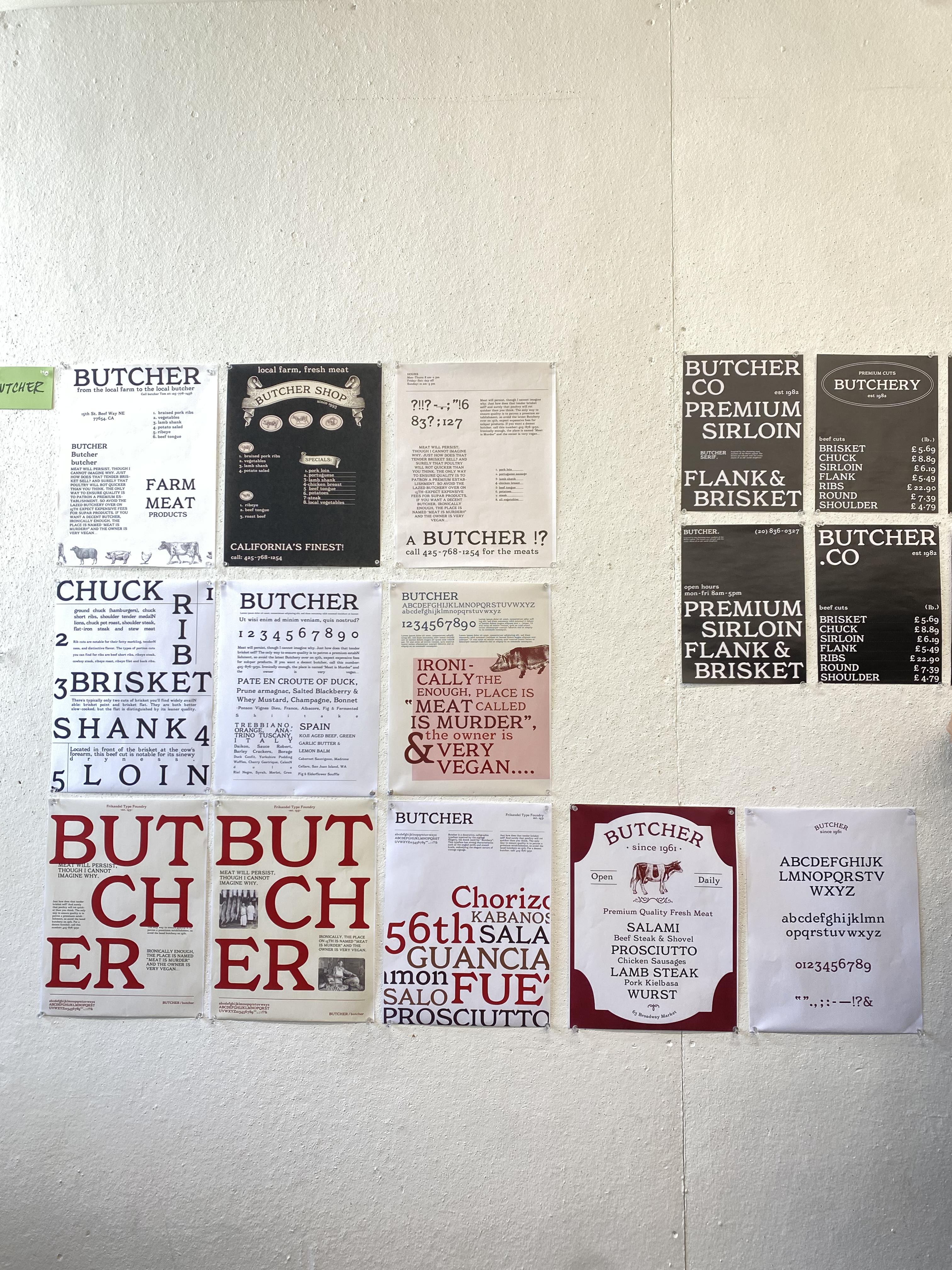
The last stage was using our finished typeface to create posters, aiming to highlight our hard work and variety of letterforms.
Reflection
Creating a typeface required an extreme amount of attention-to-detail and perfectionism. This project taught me patience and grit in the design process, and goes to show that hard work and dedication pays off in the end. Our group had a lot of fun with this one, and next steps might look like continuing to refine and submitting to competitions.
